« A good photo is a good subject, well framed. »
This unknown author quote alone summarizes a truth that every photographer learns over time. The subject is essential, of course. — But without just framing, without visual intent, he remains silent. It is in this gesture of composition, often instinctive but always decisive, that the photographer's gaze really begins.
When a photographer frames his image, he mobilizes both proven techniques and deeper sensitivities. The composition in photography is traditionally based on visual rules and tricks – such as the famous third-party rule or the use of guidelines – that guide the look and structure the image. But beyond these technical principles, the art of composing joins universal forms anchored in nature and in our perception: golden spirals, fractal patterns, symmetries of the living... These basic structures are found from the microscopic to the cosmic, and they resonate intimately with the human eye and mind. How can the scheduling of a photo thus echo the spirals of galaxies, the arabesques of a fern or the geometric visions of a hallucinated mind? This article proposes a double prism journey – technical and metaphysical – exploring the unprecedented bridges between photographic rules and deep natural aesthetics. From the rule of third parties to fractals, from Vitruve to LSD, embark on a reflection on composition as a universal language, where the photographer's gaze, the laws of nature and the mysteries of perception meet.
In summary:
I. The classical rules of photographic composition
Before diving into the philosophical meanderings, let us remember the basics. The photographic composition was built on a set of practical rules to create harmonious, balanced and striking images. These guides – partly inherited from classical painting – provide landmarks to structure a photo. These are not absolute laws, but proven principles that facilitate the viewer's reading of the image. Among the best known are: third party rule, the force guidelines and guidelines, use of the number of gold (Fibonacci spiral), the framing and attention to outlook and vertical. Overview of these tools of the photographer.
The rule of third parties: balance image
Probably the most famous compositional rule, the third party rule advises to mentally divide the image into nine equal rectangles thanks to two horizontal lines and two vertical ones. Important elements should ideally be placed along these lines or even at their intersections (often referred to as strengths). The idea is to avoid a systematically focused subject, which often makes the image static, and to create on the contrary a visual dynamism. Decentralizing the main subject to a third of the image usually results in a more balanced and natural composition by the eye.
It is interesting to note that this simplified tip actually hides an approximation of a much older principle: the number of gold. Indeed, « The third party rule is a very simplified version of the golden number rule, and is much better suited to photography » . The third-party ratio (0.33) is close to the gold ratio (0,618) but remains easier to apply quickly in the field. The photographer thus has a practical benchmark to compose « in the moment », without the need to trace scholarly calculations on its viewfinder . For example, in landscape photography, placing the horizon on the lower or upper third of the image (rather than in the middle of the picture) often gives a feeling of space better proportional between sky and earth.
Strength and guidelines: guiding the look
Tree trunks moving away in perspective or the curve of a road in a landscape can serve as a Guidelines, naturally leading the viewer's gaze to the main subject of the photo. The Force lines in composition means the large diagonals or curves which structure the image, while the Guidelines(often linear elements in the scene) are used to orient the eye inside the photo. They may consist of a road that moves away, the edge of a wharf, a row of streetlights, the wake of a cloud, etc.
According to the definition of photographer Lukas Kosslow, « the technique of the guidelines relies on natural or artificial lines to compose the image and direct the look towards the subject or the focus of interest » . In other words, these lines – whether they are obvious (a barrier, a bridge) or subtle (the alignment of people's eyes in the scene) – act as implicit arrows pointing to what you want to show. Well used, they give depth and visual consistency to the photo, in addition to telling a story. For example, a winding path leading to a subject in the distance creates an engaging visual path for the one looking at the image.


The guidelines may be horizontal, vertical, diagonal or curved. Each has a different psychological effect: the horizontals evoke stability and horizon, the verticals the strength or elevation, the diagonals the dynamism or flight, and the curves the softness and movement. A classic tip is to get these lines out from a edge of the picture to "boarding" the look from the outside to the inside of the photo. In architecture, marked guidelines (such as the edge of a building) can also structure strongly the image – to handle carefully so as not to dominate the main subject.
The golden spiral: divine proportions and strengths
While the third-party rule is the beginner's b.a.-ba, the more advanced photographers are sometimes interested in more complex grids of composition such as the Phi grid (related to the number of gold) or Spiral gold. The number of dior, noted Φ (phi), is this mathematical ratio ~1,618 highlighted from Greek antiquity and qualified since the Renaissance of "divine proportion". Applied to the visual arts, it generates relationships of lengths and placements considered very harmonious. In painting, Leonardo da Vinci and others saw it as an ideal beauty cannon. In photography, for example, it materializes by gold rectangle (a frame whose sides respect the ratio ) or by the Spiral gold, derived from the famous suite of Fibonacci (1, 1, 2, 3, 5, 8, 13...).
Visually, a gold spiral is a logarithmic curve that coils and expands according to the factor Φ at each quarter of the turn. Placed on an image, it indicates a spiral visual path to a focal point. Many classic paintings, but also contemporary photographs, have been built by positioning the key elements along this spiral. This curve is found in nature – for example, the winding of a nautilus or the heart of a sunflower – which can explain its aesthetic power. Some photographic compositions gain in dynamism by marrying this circular motif: for example, a crowd movement rotating around a central subject can be highlighted in a spiral dial.
Specifically, applying the golden spiral is more delicate than the third-party rule because it requires to visualize a curve on the image. There are, however, guides (e.g. templates in some software such as Lightroom or devices that display the Φ grid) to help use. The stake is to place "the area containing the most detail in the smallest loop of the spiral", i.e. the main subject in the last narrowed volute, then organize the other lines of the scene by following the winding. Well controlled, the golden spiral brings elegance and a asymmetric balance highly appreciated in composition: it creates a dynamic and coherent image, leading the eye fluidly from the edge to the heart of the photo.
Note, however, that the number of gold is not an absolute magic formula. Recent studies in psychology have examined whether this ratio Φ = 1,618 was universally perceived as more beautiful than other proportions. The results are nuanced, with a slight observed preference for the number of gold, especially on images of faces or works of art, but not a massive craze either. Interestingly, eye monitoring showed that subjects took less time to visually scan an image in line with the number of golds, suggesting that this structure could facilitate visual treatment by the brain. In short, the golden spiral is another tool in the photographer's palette, to be used to create a subtle harmony inspired by the traces of nature.
Break codes: when composition becomes revolution
Knowing the rules is good. Knowing when to break them is better.
The history of photography is marked by images that have marked precisely because they have transgressed the conventions. The centered framing outlawed? Some portraits of Diane Arbus or Richard Avedon claim this. The line of horizon bent to avoid? Garry Winogrand made it his signature to create an almost kinetic visual tension in his street scenes.
Breaking the rules doesn't mean doing anything. This means controlling them enough to dare. Worse with intent. A photo cut in the wrong place is a mistake; A photo with boldness is a signature. An image overexposed by accident bothers; a deliberately "burned" light can create a powerful dramatic effect.
In the composition, transgressing is creating a fertile imbalance. It is to make the look move differently, cause discomfort that attracts, trigger an emotion where the eye expected harmony. The blur, asymmetry, overload or vacuum can be creative weapons — provided they are assumed. In photography and music, dissonances can become magical.
Frame and structure: fill the frame, cut, balance
The framing is the art of delimiting what appears in the image and what is excluded from it. A good photographic composition implies judiciously completing the framework : eliminate parasitic elements, bring the subject closer if necessary, or on the contrary expand the field to give context. Simple rules accompany the framing, such as avoiding cluttering a subject (for example, in portraits, not truncate the joints pile to the edge of the image) or leaving space in the direction where a character looks or moves a subject in motion ("space rule"). Composing is first and foremost choosing what to show and how to show it.
Moreover, a good framing strives to maintain a balance in the image. This may involve the deliberate symmetry or asymmetry of visual masses. For example, a main subject placed on one side of the frame may be balanced by an interesting secondary element or background on the other side. The empty They are also important: an open area (a united sky, a sober wall) can counterbalance an area loaded elsewhere in the image and give visual respiration. The famous "unfair rule" Moreover, for still or small groups, advise to have a number of odd objects (3, 5...) in order to avoid a symmetric composition that would seem to be frozen.
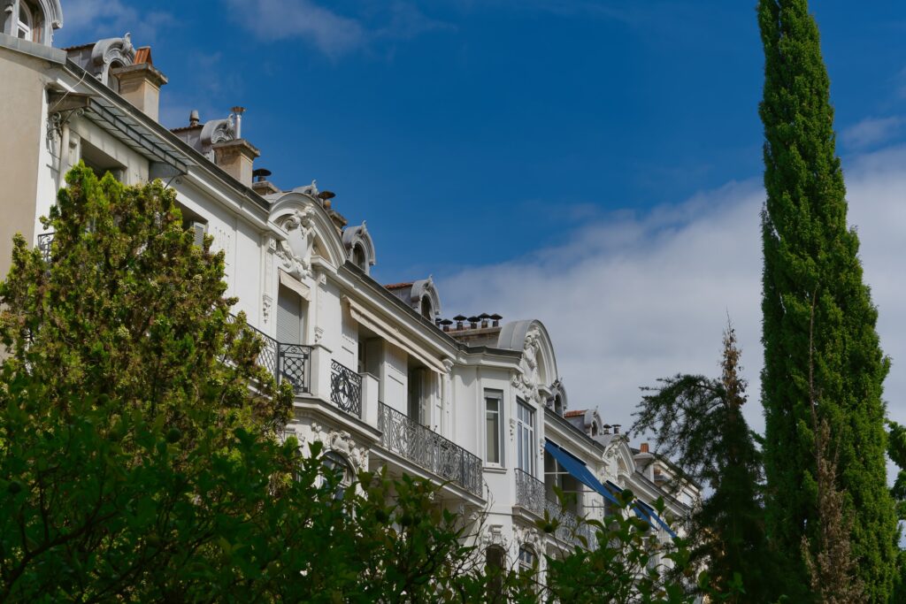
Finally, framing is also the format selected (horizontal, vertical, square, panoramic) andangle of shooting(dive, counter-dive, etc.), which strongly influence composition. The same subject photographed in landscape or portrait format does not tell the same thing. The photographer must therefore deal with these parameters in mind, always at the service of aesthetics and the message of the image.
Restressing the verticals: mastering the perspective
In architectural or urban photography in particular, a composing challenge is to manage the lines of perspective. When photographing a counter-dive building, for example, vertical lines tend to converge upwards (optical leakage effect), giving the impression that the building "penche" or narrows in height. This phenomenon can affect readability and aesthetics if one wishes a faithful representation of forms. That's why photographers talk about straighten the verticals, i.e. correct this distortion perspective so that the lines supposed to be vertical in reality become it again in the image.
There are several techniques: objective to decentralize (Tilt-Shift) when shooting, specially designed to compensate for the perspective, or correct in post-processing software (transformation tools that rearrange the image). Composing by thinking about verticals often means anticipating this correction: you have to frame a little wider to keep the margin, because the recovery will stretch some parts and require a reframe.
Why is this important in terms of composition? Because an image where the verticals are straightened appears more stable and Architectural, while tilting verticals give an impression of instability or forced point of view. Of course, one can choose to voluntarily keep the lines leaking for an artistic effect (increase the height of a skyscraper by allowing it to converge). But in many cases, especially in photo documentary architecture, the most pleasant composition will be the one where the building retains its straight proportions, as if one looked up to man without lifting the head. This joins other aspects of the perspective in composition: converging lines, depth effect, etc., which are so many tools to guide the look and give volume to the image.
Beyond the rules: Intention premium
After this review, it should be recalled that these "Rules" of composition are not immutable recipes. These are guides From the human visual experience, which you need to know... to better free yourself from it. An informed photographer will know when to apply the third-party rule or instead focus his subject for a striking symmetry effect. He will use a guideline to take the eye, or break this line to surprise. Composition is a visual language: the rules are the basic grammar, but the artist's creativity can play with it, as a writer plays with syntax. The important thing isintention andbalance.
These traditional principles – even when they are transgressed – often work because they correspond to traditional principles. deep preferences of our perception. Why does the third party rule "walk"? Why are curved lines pleasant, why does symmetry fascinate or why does a spiral seem harmonious to us? To answer these questions, let us now look at nature and neuro-aesthetics. Photographers and artists have not invented these recipes by chance: they have often discovered them by observing nature or listening to their feelings in the face of the universal forms of the living world.
II. Universal forms of living and natural aesthetics
Behind the tricks of composition is indeed a thousand year old inspiration: the nature itself. The shapes we find beautiful or balanced in image are often those found in our environment, from the smallest to the largest. There are "universal grounds" – spirals, waves, branched networks, radiant symmetries, etc. – which can be seen in plants, minerals, the human body, as well as in stars or even scientific visualisations. These fundamental forms speak to our collective unconscious forever: we see them in cave art, sacred architecture, mystical diagrams. Here we will explore some of these structures: fractals, the Fibonacci spiral, the Man of Vitruvius, the reasons for the sacred geometry, and how they reflect the organization of the living from infinitely small to infinitely large. This journey will lead us to the depths of human perception, where sometimes the boundaries of reality are blurred (under psychedelic, for example) to let these primordial forms touch on.
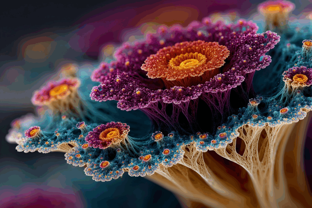
Fractals: aesthetics of repetition on all scales
One of the most fascinating concepts that appeared in the 20th century to describe nature is that of Fractal. A fractal is a pattern that repeats whatever the scale observation: zoom in on a small part of the pattern, you find a structure similar to the large initial pattern. Nature is full of fractal structures: think of a fern or the branching of a tree – each small fern sling has the general shape of an entire leaf, each twig looks like the branch that carries it, and so on. Similarly, a cut-out coastline seen from the sky has sinuous features that remain equally shredded at the scale of a creek or rock. Clouds, mountains, river networks, the bronchial system of our lungs, the network of our blood vessels – all present this property ofSelf-similarity on different scales.
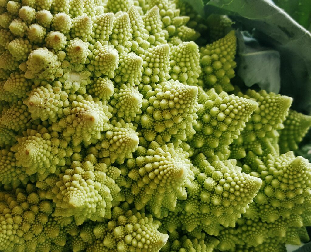
A fern with each leaf consisting of leaflets reproducing the shape of the whole branch – an example of a pattern Fractal in nature, where the same form is repeated on different scales. The fractal term, popularized by mathematician Benoît Mandelbrot in the 1980s, was also used to analyze art. For example, Jackson's famous abstract canvases have been discovered Pollock have a fractal character: by numerically analysing the distribution of paint drops, researchers have shown that « Pollock's paintings are as fractal as the natural landscape motifs » . In other words, the patterns of his paint ripping show a similar complexity to that of the forms of a tree or a shoreline. This Fractal aesthetics would give his works an organic quality that the public intuitively feels, which could partly explain their universal appeal.
Beyond art, it seems that our visual system itself is particularly "fluid" to treat fractals. A theory called fractal fluency suggests that, because we have evolved in fractal-filled environments (forests, clouds, flames...), our eye and brain have optimized for rapid analysis. Looking at fractal patterns would put us in a kind of Perceptive comfort zone. Experiences have shown that contemplating fractal images can lead to stress reduction of up to 60% in the observer . It's huge for a simple visual stimulus: it's equivalent to a major non-pharmaceutical soothing effect. By measuring brain activity (EEG) and skin conductance, scientists found that exposure to these repeated patterns causes significant physiological relaxation. Even the post-operative healing time of patients improves when they have a view of nature or natural images, compared to a white wall.
In short, fractals embody an aesthetic of "ordered complex" which seems deeply inscribed in us. They bring coherence and the stability on all scales, which our brain recognizes and appreciates. Artists, often intuitively, exploit this power: we find fractal repetitive motifs in Egyptian art, in Asian mandalas, in Moorish mosaics, in Escher or in the Large Wave Hokusai for foam motifs.
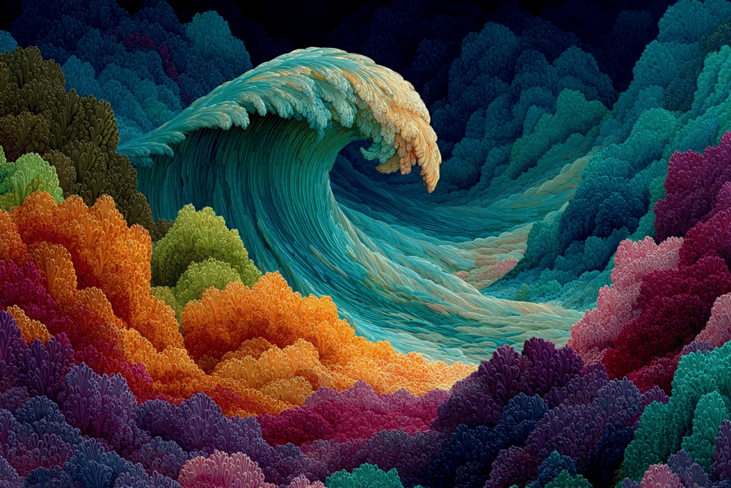
The Great Wave of Kanagawa (Hokusai, 1830) shows repetitive forms at multiple scales, especially in sprays and wave movement. This iconic motif of Japanese art illustrates how artists are inspired by natural fractals (here the wild sea) to create a dynamic and harmonious aesthetic. So it is no wonder that we find this fractal imprint in the photograph as well. Photographing the branches of a tree in winter, the cracks of a dry ground or the volutes of a stormy cloud, it is in a way grasping these universal forms that are fractals. A landscape photographer can strengthen his composition by identifying these patterns: for example, integrating a tortuous root that repeats the silhouette of a river in the background creates almost visual coherence Magic. This is the sign that the photo relies on a natural geometry that our eye unconsciously recognizes.
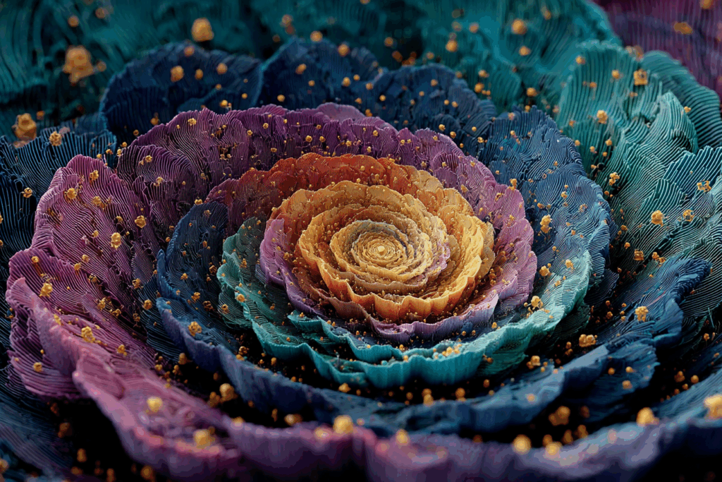
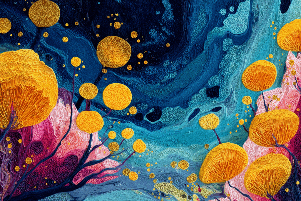
Fibonacci Spirals: the signature of the living, from shelling to galaxies
Among the recurring forms in nature, the spiral occupies a place of choice. It can be seen on all scales: from the tiny spiral snail shell, to the meteorological cyclones, to the spiral galaxies that rotate in the universe. Many of these natural spirals are logarithmic, i.e., they roll up and expand without changing shape. A particular logarithmic spiral is said Fibonacci spiral (or gold spiral) when its expansion rate corresponds to the number of golds.
The Fibonacci spiral appears in particular in the disposition of the phyllotaxis (the arrangement of leaves around a stem) of many plants, or in the geometry of sunflower flowers, where the seeds form two series of intersected spirals the number of which follows... the continuation of Fibonacci (34 spirals of one direction, 55 of the other, for example). It is not a coincidence that nature adopts these arrangements: they allow for a optimization space and light capture. The golden spiral maximizes for example the efficiency of seed storage in a flower or the exposure of leaves to the sun. The result is as aesthetically striking, to the point that the human eye sacralised.
In photography, we saw how the Spiral gold serves as a grid of composition. But even without tracing this template, the photographer benefits from detecting and exploiting the spirals present in his subject. A spiral shell presented by three-quarters, the spiral curvature of a staircase seen from the top, the whirlwind of a fluttering liquid – these motifs captivate the almost instinctively look. They evoke the movement and growth. Indeed, many things increase spiral in nature: the horn of the ram, the pine apple, the galaxy swallowing matter...
There is also a symbolic and philosophical dimension to the spiral: it is a path that winding towards infinitywithout ever closing on himself. Many cultures have seen it as a symbol of the cycle of life, eternal return or spiritual evolution. The photographer, consciously or not, can play with this evocation. For example, photographing a helical staircase plunged into darkness is potentially suggestive of an idea of infinite ascent or descent, an endless introspection. The narrative power of the spiral is very real.
To link it to our theme, let us note that the spiral fascinates all the more as we find it from microscopic to macroscopic. It's one of the famous shape bridges between microcosm and macrocosm. Astrophysicists have found that many galaxies (such as Messier 99, at 50 million light-years) have « strong arms wrapped clearly around the center » – real cosmic spirals well drawn. The image of these galactic arms can even be superimposed on a golden spiral to see the similarity of structure. From there to say that the universe itself follows the number of gold, there is only one step... that some do not hesitate to pass poetically.
In reality, the presence of the golden spiral in a galaxy can be a visual coincidence (all log spirals pass through close proportions). But the analogy is beautiful: « galaxies rotate and rivers flow – each is the fractal memory of the first breath of creation », writes photographer Robbie George . In its imaginative language, it links the spiral of the Milky Way with that of a river current on Earth, as if the same geometric melody Repeated everywhere. This idea of a universal spiral signature refers to the notion of self-organised structures We find it on all scales. For the photographer, this is an invitation to think that each small spiral in its frame (a fern, a shell) may unconsciously refer to these grandiose forms of nature, and thus to exploit their evocational power.
Human Proportions and Vitruvian Man: Body Harmony
The famous drawing of Man of Vitruvius (circa 1490, Leonardo da Vinci) inscribed the human silhouette in a perfect circle and square. It symbolizes the idea that the proportions of the body obey universal and harmonious relations, echoing the ideal geometry of nature and architecture. Beyond plants and shells, the human being himself carries proportions that have fascinated artists and scientists. The drawing by Leonardo da Vinci, inspired by the treatise of the Roman architect Vitruve, illustrates the correspondence between the human body and the elementary geometric forms. Hands and legs apart, Vitruvian man shows that a body can fit perfectly into a circle (symbol of heaven, of the divine) and a square (Earth symbol). The ideal proportions according to Vitruvius (for example, the span of the arms equal to the total height of the body) made it a cannon of beauty and harmony.
This interest in the proportions of the body has direct extensions in photography, in particular in on portrait and composition including human subjects. Knowing the "ratios" of the body helps to frame aesthetically: for example, it is often recommended not to cut a person to non-natural places (such as knees or neck) because it breaks the coherent perception of its proportions. Similarly, the position of the human subject in the frame can benefit from these considerations: a foot portrait will be pleasant if the environment around the model respects a certain balance (you avoid having the head too close to a edge, etc., so as not to give the impression of crushing or stretching the person).
More subtly, the number of gold in the proportions of the human body has sometimes been mentioned – for example, the ratio between navel height and total size. Although the direct connection with Φ is subject to debate (our bodies are variable and far from being exactly in these ideal relations), it is undeniable that the sense of proportion is crucial in art. The Greek sculptors then reborn theorized, speaking of a mathematical harmony of the body. The photographer, on the other hand, can inspire him to play on the effect of his focal points (avoid too much deformation of the body with a wide angle, for example, except for voluntary artistic research) or to place several people in a balanced image.
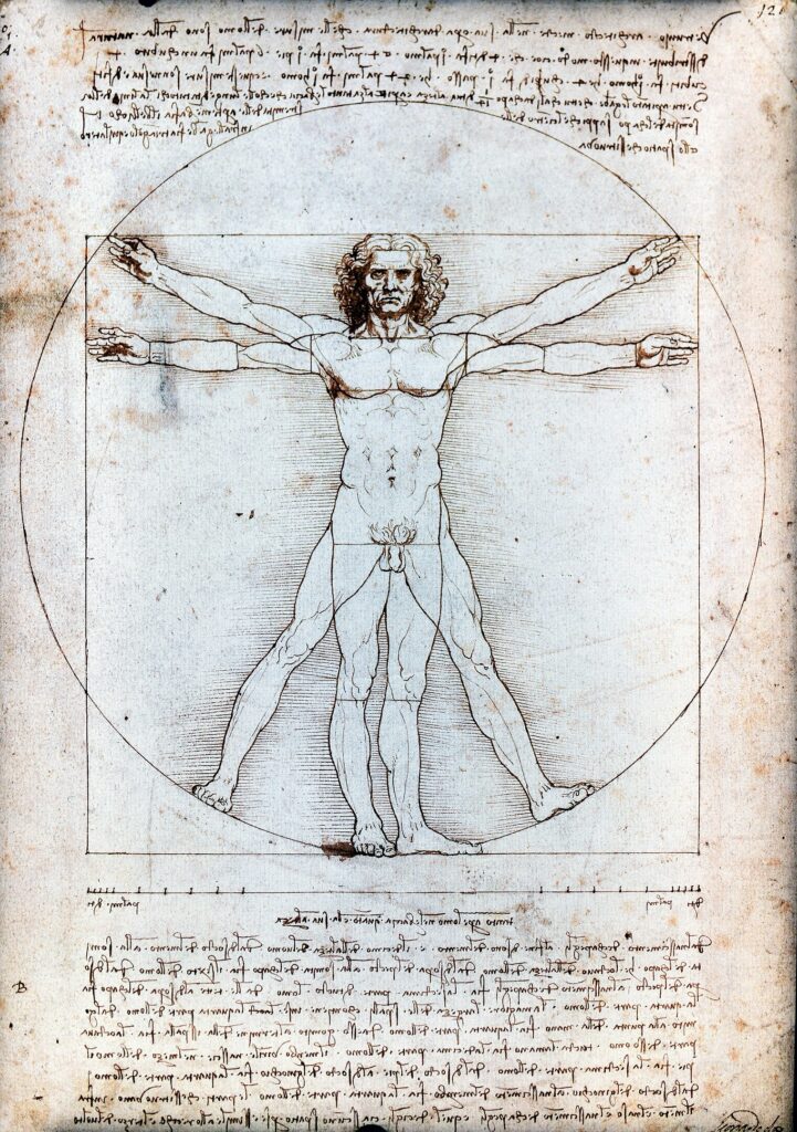
The figure of Vitruvius also reminds us that the human has long been considered a microcosm reflecting macrocosm. « Man is the measure of everything », said the humanists. Thus, our perceptions could be calibrated on ourselves. A pleasant composition is often one in which one could almost imagine a virtual human presence respecting these proportions (hence the importance of understandable scales, heights "at eye height", etc.). In both street and landscape photography, integrating a reference human silhouette can suddenly give meaning and scale to composition – a sign that we spontaneously seek the human in the organization of the image.
Sacred geometry and universal patterns
Since ancient times, wise men and artists have identified certain geometric patterns as sacred or carrying a particular energy. The sacred geometry includes forms such as the circle, triangle, Starred pentagon (pentagram), the reason for the flower of life, Plato solids (cube, tetrahedron, etc.), or the famous Fibonacci suite. The underlying idea is that « certain forms and proportions reflect universal truths and patterns, symbolizing the order and harmony of the cosmos » . These forms are found in Tibetan mandalas, roses of Gothic cathedrals, plans of Hindu temples, or Islamic mosaics. Each of these cultures, with its own symbolic language, assumed that the structure of reality could be told through pure geometrical figures.
What does it have to do with photography? On the one hand, photography can capture these patterns where they appear in the real world. For example, an architectural photographer will be able to play with the radial symmetry of a rosace glass window, an abstract photographer will be able to enjoy isolating the hexagonal structure of a snowflake or the spiral motifs of a star cactus (astrophytum). On the other hand, the photographer can Compose by creating or recognising these forms: by a perfectly centred dive point of view, one can transform a circular fountain into a visual mandala; by a long exposure one can obtain circles of light reminiscent of the flower of life.
Sacred geometry often brings a dimension contemplative images. A very symmetrical composition, based on a circle for example, produces an effect of calm, reassuring order. Conversely, introducing a sacred form into a chaotic scene can create a striking contrast (imagine a roaring alley but where a perfect triangle of shadow and light is drawn). Some photographers consciously incorporate these symbols: the triangular shape, for example, is used for its ability to structure the image (three points of interest forming a triangle give stability and perhaps unconsciously refer to the trinity of the stable forms).
Ultimately, the use of these universal motifs, whether fractal, spiral or geometric, serves a purpose: talk to the visual unconscious the spectator. Everything happens as if when you see a beautiful photo, you feel confusedly the hidden order of nature. The photographer then reveals these fundamental forms. In the next section, we will see that this impact on perception can be studied by science, and that it is particularly striking in altered states of perception.
III. Deep sensory perception: when the eye of the mind sees the fundamental forms
After exploring the correspondence between natural forms and composition, it is time to dive into the human perception She herself. Why do these universal forms mark us so much? Are there predispositions in our brain to perceive spirals, fractals, geometric patterns? Psychology and neurosciences are beginning to provide answers, and this field is sometimes called the neuro-aesthetics reveals fascinating things. Research shows how the brain reacts to harmonious images (e.g. containing the number of gold or fractals). At the same time, the exploration of modified states of consciousness – under the influence of hallucinogenic substances such as LSD or psilocybin fungi – has shown the spontaneous appearance of intense geometric forms. When our usual perceptive filters fade, it seems that our visual cortex generates by itself some Basic reasons – proof that we are literally wired for these forms.
Geometrical hallucinations: tunnels, spirals and inner mandalas
Many witnesses who have consumed psychedelics (LSD, mescaline, psilocybine...) report the appearance of highly structured visual hallucinations: moving coloured motifs, often geometric, that occur with open or closed eyes. It is remarkable that these patterns are similar from one person to another, from one culture to another. Since the 1920s, psychologist Heinrich Klüver catalogued these « constant forms » hallucinations under mescaline. He identified four main types: tunnels/runnels (concentric tunnel vision impression), the spirals, the netting (grills, honeycomb patterns or lime trees) and spider webs . Later, it was found that these same forms may appear in other circumstances: sensory deprivation, deep meditation, ophthalmic migraines, or even simply pressing on the eyelids. This suggests that these are "default" states of the visual brain, which emerge as soon as sensory input is disturbed.
What do these hallucinations tell us? Neuroscientists see a window on itorganization of the visual cortex. Indeed, it was possible to mathematically model how a network of spatially arranged neurons, when self-exciting, tends to produce patterns in the form of stripes, targets or spirals – exactly the forms seen under LSD. The pioneering work of Jack Cowan and Bard Ermentrout in the 1970s showed that by simulating the retina as a kind of neural grid, we obtained patterns very close to "constant form" of Klüver . In other words, our brain has its own own natural patterns. These are no longer those of the outside world (trees or galaxies) but those of its internal connectivity.
Thus, see psychedelic spirals Could reflect the spiral architecture of our cortical visual areas themselves! Similarly, the honeycomb networks seen with closed eyes would correspond to the hexagonal arrangement of neuron columns in V1 (the first visual area of the cortex). It's dizzying: sacred geometry reappears at the heart of our brain biology. In some shamanic traditions, geometric hallucinations are interpreted as an access to a fundamental level of reality – the language brain or mind. Without going so far, science confirms that « hallucinogenic drugs often show fractal or geometric patterns » universal, sign that our visual circuits have clean modes ooscillation that take these forms.
For the photographer, these discoveries may seem distant. And yet don't we often try to return our images "psychedelic" in the sense of visually extraordinary? The trends of some contemporary art photographs (overprints, light painting, kaleidoscopes in long pose) deliberately recreate these hypnotic motifs. For example, turning your camera by zooming during pose produces a spiral tunnel effect worthy of hallucination. Similarly, editing software makes it possible to create mandalas from photos of crowds or foliage by replicating and sympheticizing the image. These experiments illustrate how constant form The brain can also inspire new photographic aesthetics. After all, if these reasons fascinate so much, it may be because we carry them within ourselves. – in the folds of our cortex.
Neuro-aesthetics: brain, beauty and numbers
The question of Why such image is considered beautiful or not has long taken up philosophy. Today, neuro-aesthetics captures it by measuring what is happening in the brain in the face of beauty. It has already been mentioned the measured soothing effect of fractals or the ease of visual processing for the number of gold. These two findings suggest a key idea: beauty = cognitive economy. A well-composed image would literally be easier to look at and treat for our visual system, hence a pleasure, relief, an "aesthetic frisson". When the brain includes quickly a structure, it releases a small reward (neurotransmitters of well-being). It is therefore possible that the third party rule or the ratio 1,618 will appeal because they offer a optimal structure for our visual circuits. In this sense, the number of goldcould be seen as a "Visual Affordance", a proportion offering an ideal playground to our neurons.
Other studies in MRIf (brain imaging) have shown that the observation of a work of art strongly activating the feeling of beauty is accompanied by a particular activity in the orbitofrontal cortex (area related to pleasure and reward). It is tempting to link this to the characteristics of the image in question: colors, symmetry, etc. For example, symmetry (a symmetrical face, a symmetrical architecture) is often found more beautiful, and it is known that the brain more easily treats symmetrical forms (it "compresses" information by coding only half and duplicates). Similarly, the Proportion will play: experiments from the 19th century (Fechner) showed a public preference for rectangles of about 1:1,618 ratio. Even if not all researchers agree on the universality of the number of gold, it is clear that certain proportions return in our designed objects (credit cards, buildings, A4 papers that are on ratio, etc.) – a sign that we are spontaneously seeking proportional harmony.
Finally, recent advances in EEG and even artificial intelligence allow us to explore the hypothesis that our neurons have "favorite patterns". For example, a fun study would be to show participants photographs whose composition has been modified (e.g., a centered version vs. a third-party version vs. a golden version of the same subject) and to see if there is systematically a version that triggers more relaxation alpha waves or more orbitofrontal activation. In the meantime, we have many converging clues to think that universal forms discussed above act on us in depth. They do it all the more when they are subtle: a photo where the spiral is guessed but not traced explicitly, where the fractal is suggested by the rhythm of the elements, will charm without knowing exactly why.
This is the magic of the successful composition: She secretly orchestrates natural laws to speak to our brains. The photographer then joins the Gothic architect or monk in trance who draws his mandala – all seeking, by forms, to Raise the soul or calm the mind. The next time you'll be surprised to love an image without a particular subject, look at it more closely: perhaps it hides some golden spiral in its lines, some fractal in its textures or a quasi-human balance in its structure.
IV. Fusion of technique and sensitivity: towards a universal aesthetic in photography
After this journey through photographic rules, deep nature and human brain, what to remember? No doubt that Nice composition is more than respecting some academic rules. This is the encounter between the technical creativityof the photographer and Timeless Forms which go beyond her only intention. By aligning his viewfinder according to the rule of third parties, he walks without knowing it in the footsteps of Pythagoras and Vitruve. By driving a perfect flight line, he unconsciously joins the balances of cathedrals and forests. By tracking a nice curve, it matches the spirals of galaxies.
This merger of the Technical and Universal Sensitive Perhaps the key to the images that mark us deeply. A composition that works, it's kind of like if "Everything was connected to everything else.", to paraphrase Leonardo da Vinci : « Learn to see. Realize that everything is connected to everything else. » . In a good photo, each element is in its place not only because it "does pretty", but because it makes sense on an almost organic level.
We understand better why some landscape photographs calm us instantly: they often present fractal patterns of nature that speak in our eyes tired of artificiality. We also understand why portraits can reveal a particular aura: the photographer managed to compose a frame in harmony with the proportions of the subject, creating an almost tangible presence. Similarly, in abstract or macro photography, playing with symmetries and repetitions can give the illusion of contemplating a "sacred geometry" which captures us far beyond the immediate aesthetics.
In practice, this does not mean that you have to try at all costs to layer your photos on rigid diagrams. On the contrary, it is by developing its Intuitiveness and its visual culture a photographer will naturally incorporate these forms. Ansel Adams said that there are always two people in each image: the photographer and the spectator. One might add that there is also a little universe in every successful image: a fragment of the laws of the world that is visible. Human eye seems to like to find unconsciously these familiar echoes.
Compose, therefore, it is a bit like composing in music: we have ranges (rules) and natural harmonies (universal laws). The photographer is free to play his visual melody, but if he touches the right notes – those in resonance with the great motifs of nature – then his photo will have this Additional soul which makes it unforgettable. In the era where millions of images are produced every day, it may be in this universal authenticity that exceptional photographs will stand out. Those who, without knowing exactly why, make us say "wow"and transport us, within a moment, to the limits of the sensitive and the universal.
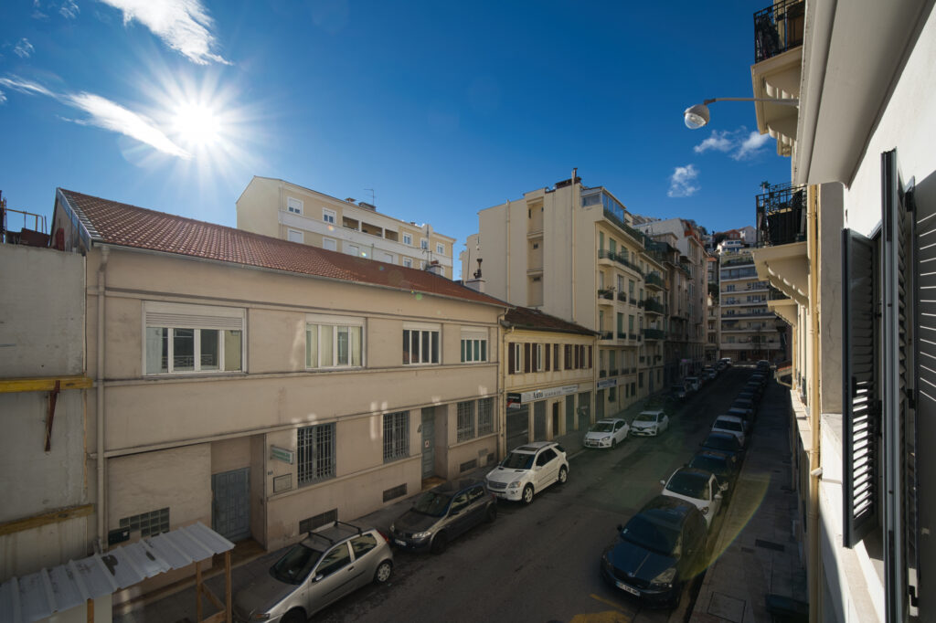
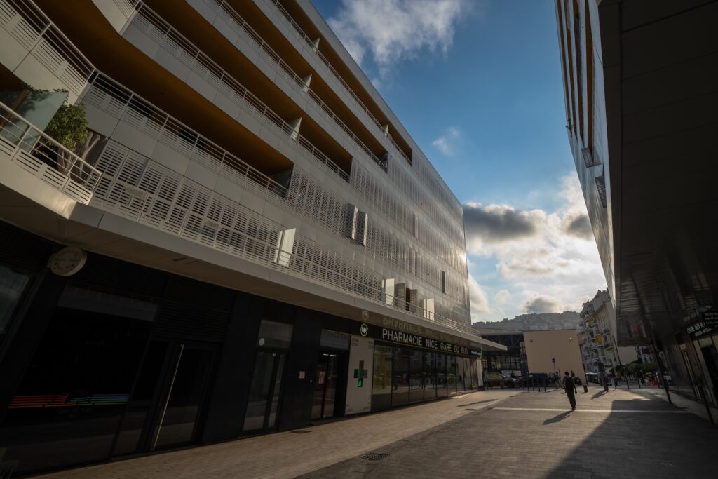
As real estate photographerI don't always have the luxury of composing an image for hours. But every time I frame a piece, choose a focal point, straighten a vertical or modulate the light, I mobilize – sometimes consciously, often unconsciously – everything I know and everything I feel of these universal principles. I'm not just trying to "show a play," I'm looking for create an image that speaks of balance, light, circulation, envy. Because I know that every photo is an invitation: the one to enter a place, to project there, to dream there. And for that, the composition must be Resonates. Let it be clear, fluid, harmonious. There is no secret: a good framing is a visual message that circulates without noise. And if this message just touches, then the photo reaches its goal.
Bibliography
- From Bartolo, D. et al. (2022). "The golden ratio as an ecological affiliation leading to aesthetic attractiveness."Psychological Journal, 11(5), 729-740 .
- Taylor, R. (2017). "Fractal Patterns in Nature and Art Are Aesthetically Pleasing and Stress-Reducing."Smithsonian Magazine, 31 March 2017 .
- Photo-Landscape.com – The golden number rule. Blog Photo-Landscape, 2016 .
- Adobe Creative Cloud – Guide to Guidelines in Photography. Adobe, online article consulted in 2023 .
- Thomas R. (2009). "Uncoiling the Spiral: Maths and hallucinations." More Magazine University of Cambridge, December 2009 .
- Leonardo da Vinci – quote: « Learn to see, realize that everything is connected to everything else. » (circa 1500)
- George, R. (2023). "Fractals & Fibonacci: Nature Robbie George's blog, robbiegeorgephotography.com .